
VINMETAL — A BRAND BUILT AROUND ITS MATERIAL
From the strength of steel to a distinctive brand identity
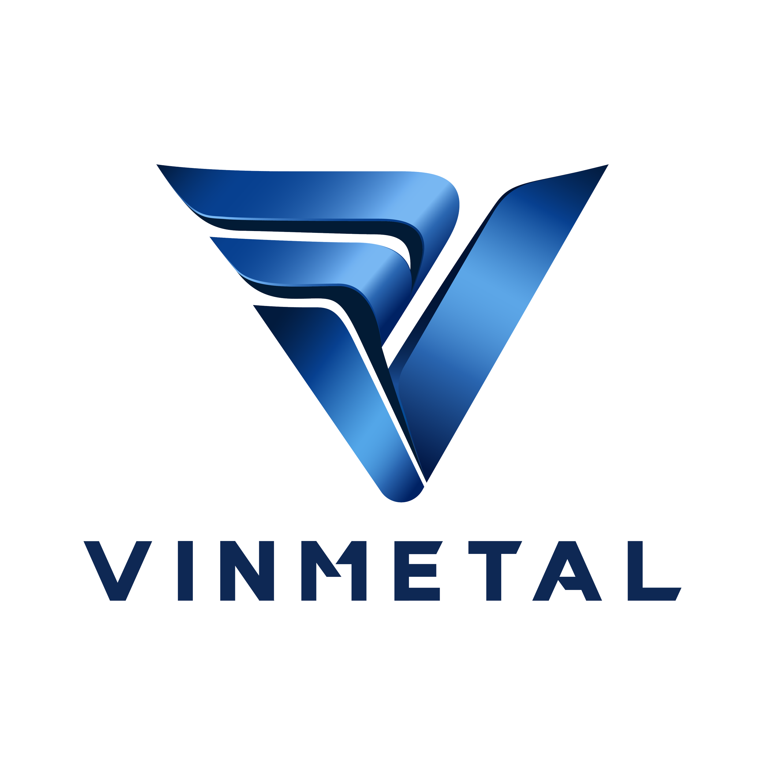
VinMetal operates in an industry where strength, precision, and durability define both its products and its expertise. But beyond being a material, steel also carries a sense of structure, transformation, and progress — qualities that became the starting point for shaping VinMetal’s visual identity.
For NEWNOW, the challenge was to translate these inherent characteristics into a distinctive and cohesive brand presence, starting from the logo and extending through a complete set of visual identity guidelines and brand applications.
WHAT INSPIRED IT
Starting with the nature of steel
The creative direction began by looking closely at the qualities that define steel: strength, structure, precision, and resilience. Rather than simply representing the material through conventional industrial imagery, NEWNOW explored how these qualities could be expressed through a more contemporary visual language.
The idea was to create an identity that feels grounded in the world of steel while moving beyond the expected codes of heavy industry. The visual direction therefore balances a sense of strength and solidity with clarity, precision, and modernity, reflecting VinMetal as a brand built on industrial expertise while looking toward the future.
This thinking became the foundation for the development of the logo and the broader visual identity — giving the brand a recognizable character that is both industrial in its roots and contemporary in its expression.
FROM IDEA TO VISUAL LANGUAGE
ranslating the character of steel into design
With the creative direction established, NEWNOW translated these characteristics into the key visual elements of the VinMetal identity — from the logo and color palette to typography, graphic elements, composition, and imagery.
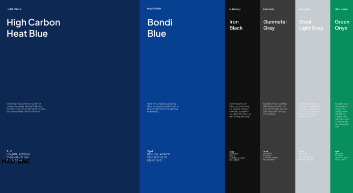
The color system draws from the visual character of steel and the brand’s industrial environment. Deep blues establish a sense of strength, confidence, and reliability, while shades of grey and black bring depth and reinforce the materiality of the industry. A green accent introduces a sense of energy and forward movement, creating a visual balance between solidity and progress.
Typography and graphic elements follow the same principle. Clean structures, clear hierarchy, and precise compositions reflect the technical nature of the industry, while a contemporary approach keeps the overall identity refined and approachable.
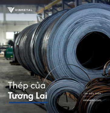
Photography also plays an important role in bringing the identity closer to the people behind the business. Alongside steel products and industrial environments, imagery featuring the people, teams, and working processes behind VinMetal adds a more human dimension to the brand.
Together, these elements establish a visual language that gives VinMetal a stronger and more distinctive presence across its communications.
FROM VISUAL LANGUAGE TO SYSTEM
Turning the identity into clear and consistent guidelines
A strong identity needs more than individual design elements. It needs clear principles that allow the brand to remain consistent as it appears across different materials and environments.
Building from the logo and visual language, NEWNOW developed the VinMetal Brand Guidelines, defining how the identity should be used and expressed across key brand touchpoints. The guidelines bring together the core elements of the identity — including logo usage, color system, typography, graphic elements, imagery, and layout principles — into a unified framework.
Rather than limiting the identity to a fixed visual formula, the guidelines provide a clear foundation for adapting the brand across different applications while maintaining its recognizability.
This gives VinMetal a practical visual system that can be consistently applied by different teams and across different communication formats, helping the identity remain cohesive as the brand grows.

FROM SYSTEM TO EXPERIENCE
Bringing the identity into everyday brand touchpoints
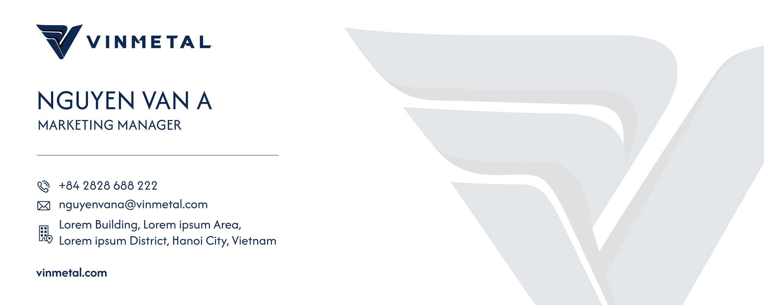
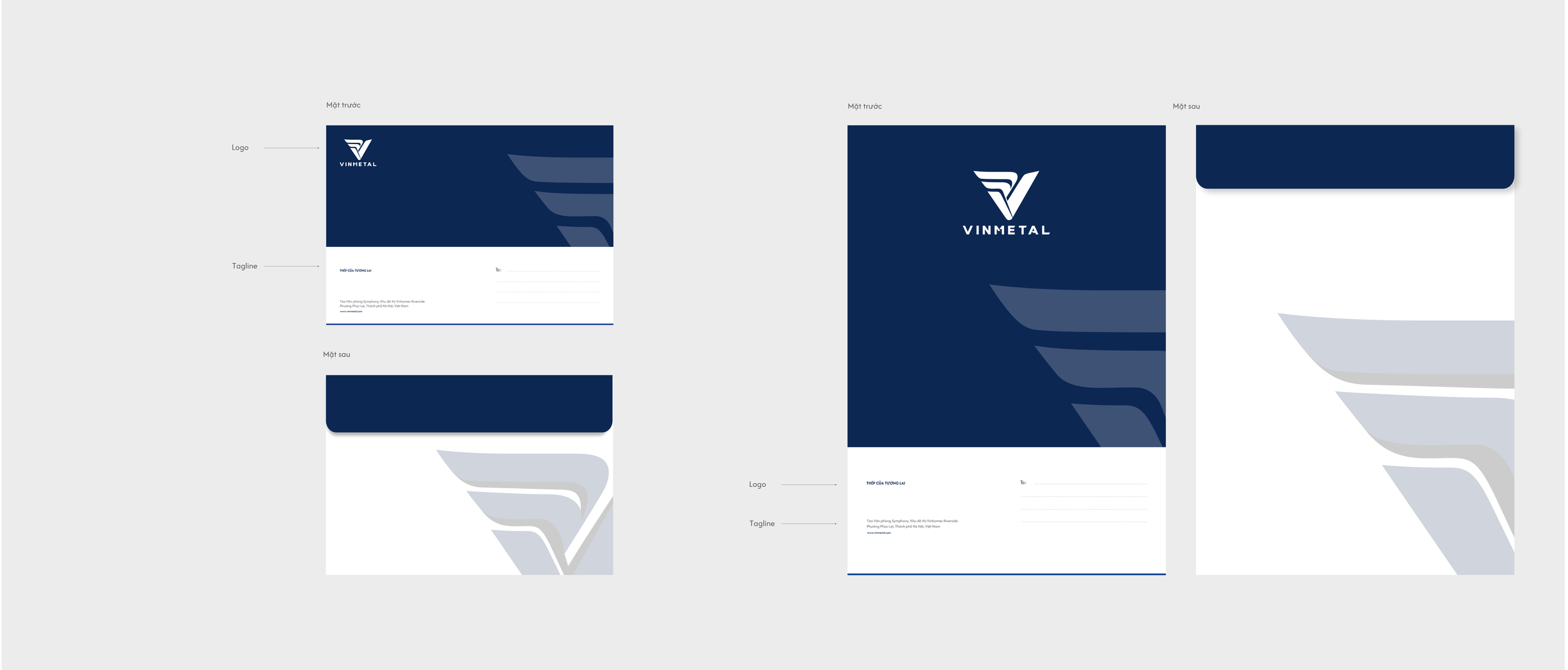
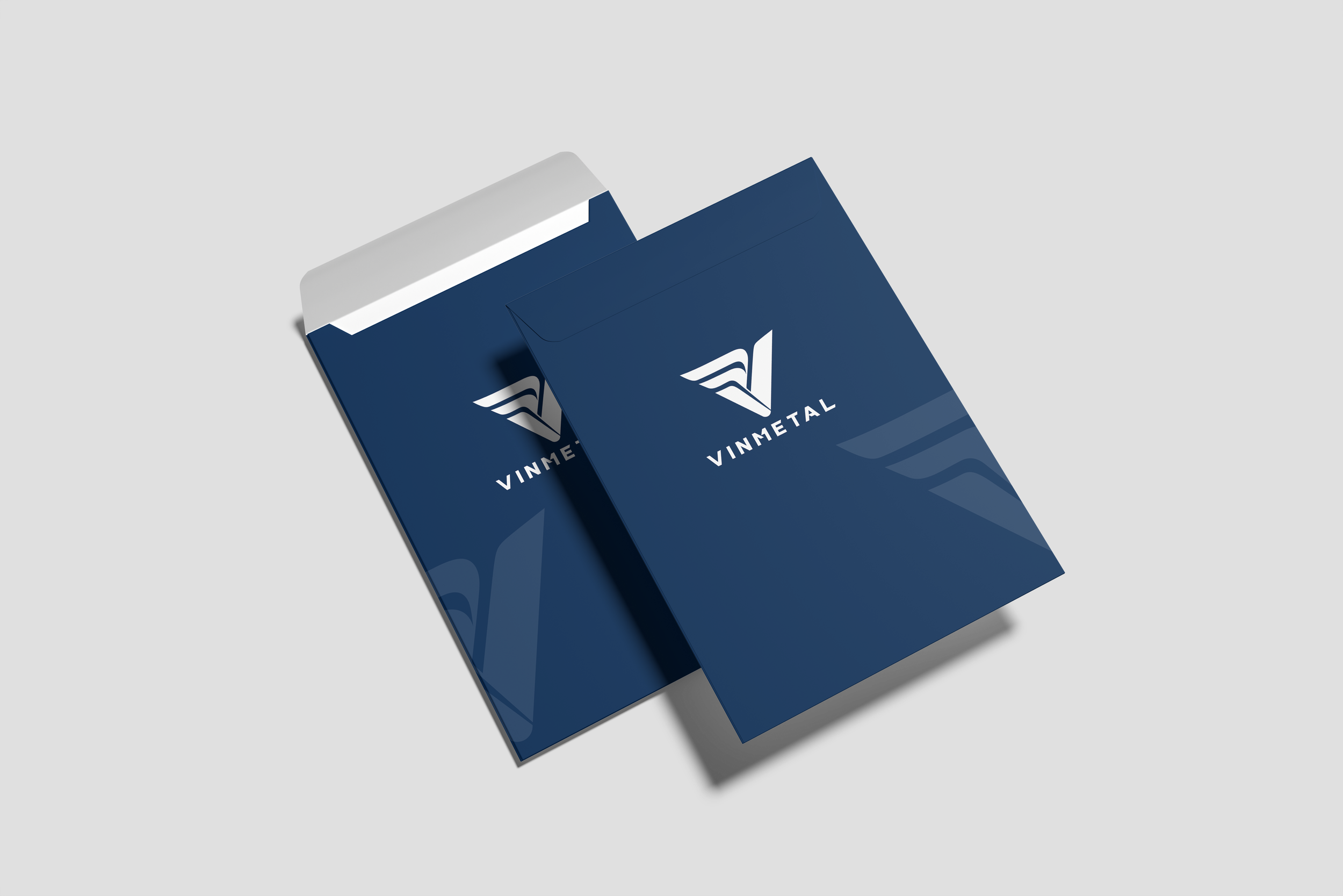
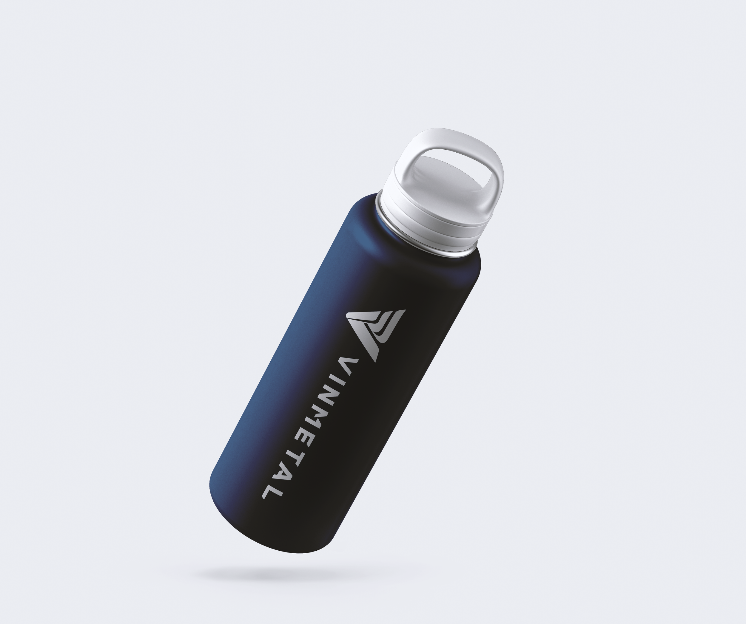
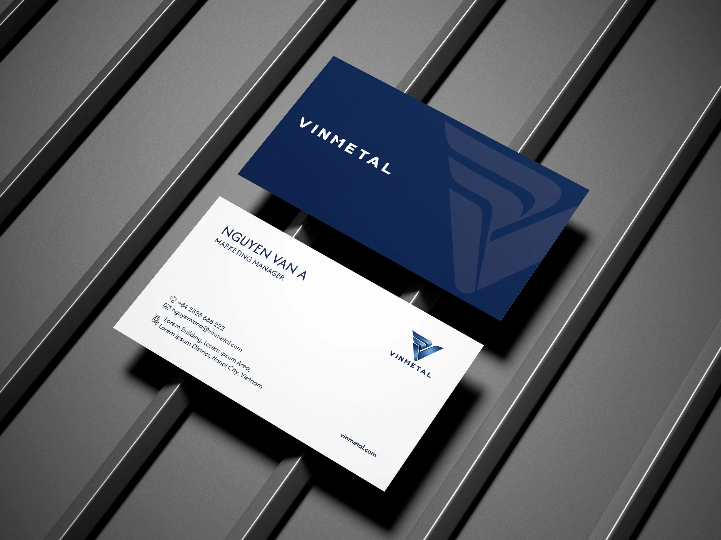
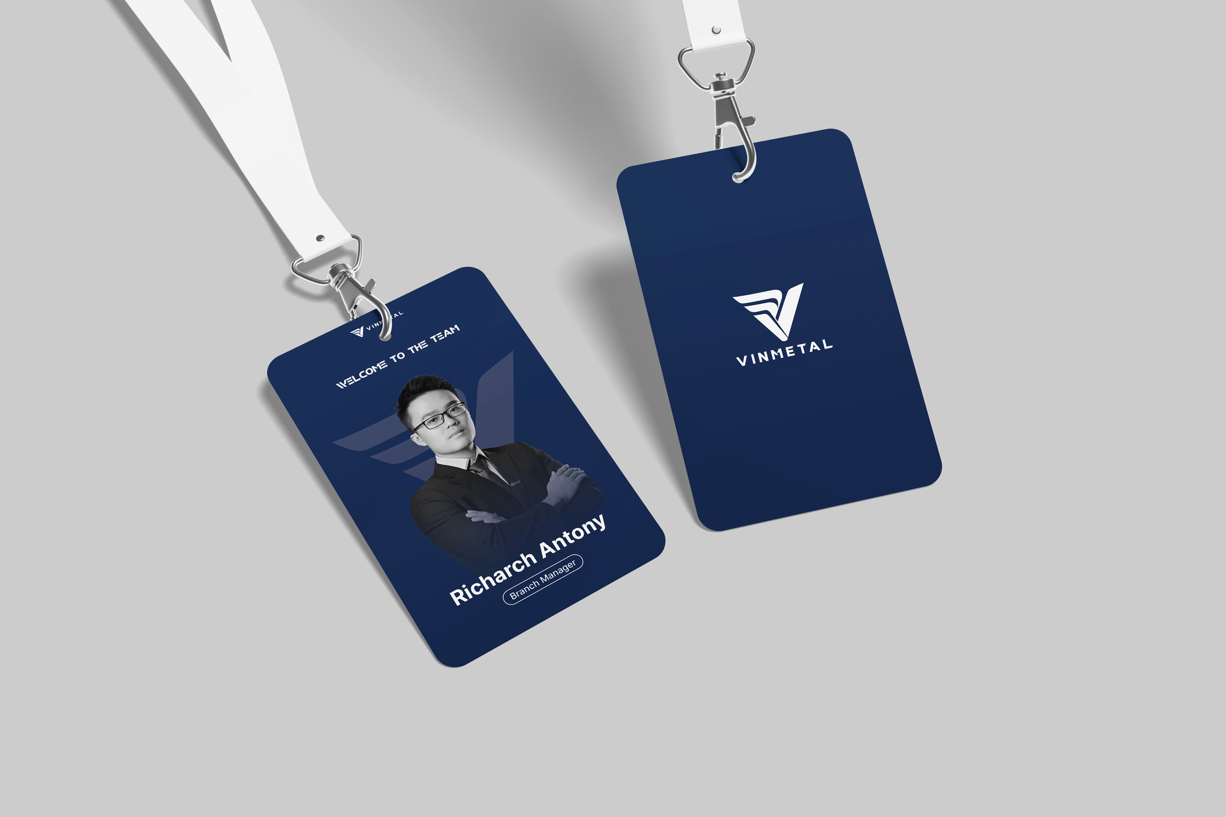
With the visual identity and guidelines established, the system was translated into a range of physical and communication applications, allowing VinMetal’s new visual language to become part of its everyday presence.
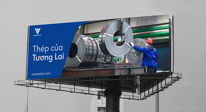
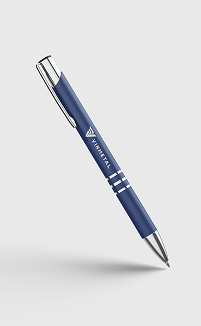
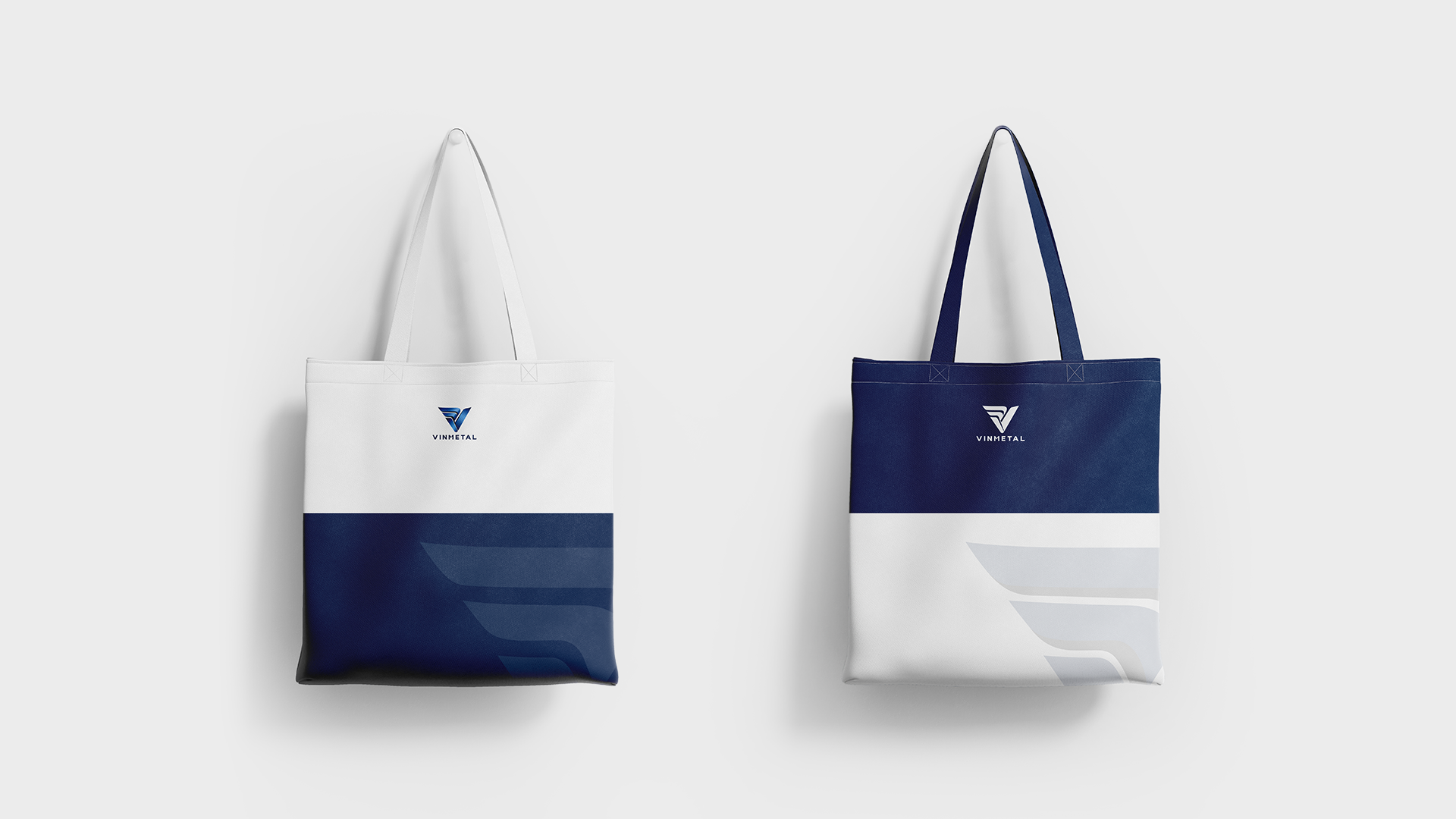
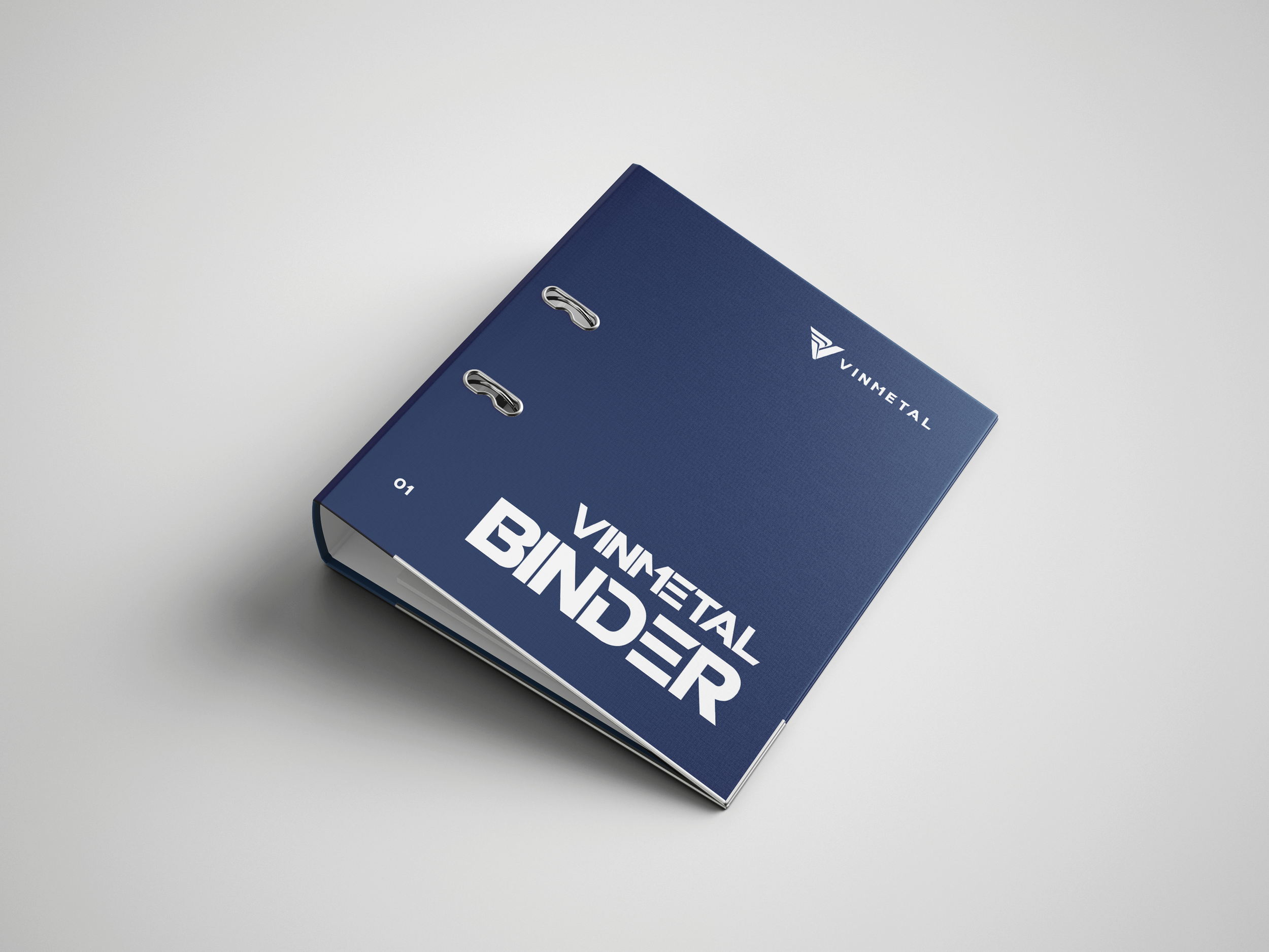
From corporate stationery and employee uniforms to signage, environmental graphics, product-related materials, and outdoor communication, the identity adapts to different contexts while maintaining the same core visual character.
Across these applications, color, typography, graphic elements, and imagery work together to create a consistent experience. The result is a brand identity that does not exist only within the guidelines, but can be seen and experienced across the different spaces and materials through which VinMetal communicates.
THE VALUE OF A STRONG IDENTITY
Building consistency for a brand with a long-term vision
For a company operating in an industry defined by strength and durability, a clear and consistent identity provides an important foundation for long-term growth.
NEWNOW’s work for VinMetal goes beyond creating a contemporary visual appearance. By developing the logo, visual identity, brand guidelines, and key applications as one connected system, the project gives VinMetal a clearer and more distinctive way to present itself across different touchpoints.
The result is an identity that reflects the character of the steel industry while giving VinMetal the flexibility to communicate across its people, products, spaces, and audiences.
Ultimately, the project creates more than a new visual presence. It gives VinMetal a cohesive visual foundation — one that is strong enough to represent where the brand stands today, and flexible enough to evolve with where it is heading next.
PROJECT INFORMATION
Client
VinMetal
Project
VinMetal Brand Identity & Guidelines
Agency
NEWNOW
Services
Logo Design · Brand Identity · Brand Guidelines · Visual Identity · Art Direction · Graphic Design
Applications
Corporate Stationery · Uniform · Product Applications · Signage · Environmental Graphics · Outdoor Communication
