
VinBioCare — From Science to Brand
Translating biotechnology into a visual language that feels precise, progressive, and full of life
VinBioCare operates at the intersection of biotechnology, science, and innovation — a field defined by complexity, precision, continuous development, and the pursuit of new possibilities. As the brand works across a highly technical and constantly evolving industry, its visual identity needed to communicate scientific credibility while also reflecting a sense of progress, energy, and human connection.
The design direction was built around one question:
How can a scientific brand feel sophisticated and credible, while remaining dynamic, approachable, and contemporary?
Rather than relying on conventional scientific imagery or a purely clinical aesthetic, NEWNOW developed a visual system that translates the inherent characteristics of science into a distinctive and flexible design language. By turning ideas such as precision, growth, movement, and connection into visual elements, the identity creates a more contemporary expression of biotechnology — one that feels both scientifically grounded and full of life.
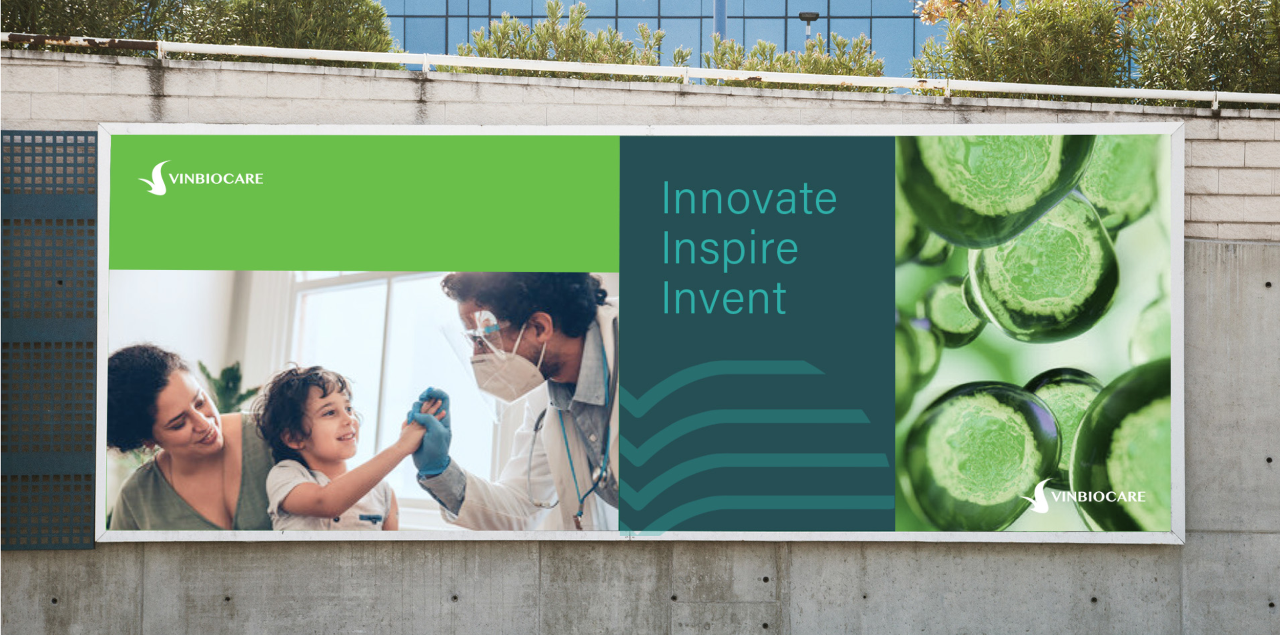
SCIENCE AS THE FOUNDATION
The identity begins with three core characteristics of biotechnology:
PRECISION
Science requires structure, accuracy, and clarity.
GROWTH
Biotechnology is constantly evolving, developing, and transforming.
CONNECTION
Scientific progress is driven by the interaction between people, knowledge, and technology.
These three characteristics became the foundation of the visual direction — moving the brand beyond a purely clinical aesthetic toward a balance between structure and organicity, precision and movement.
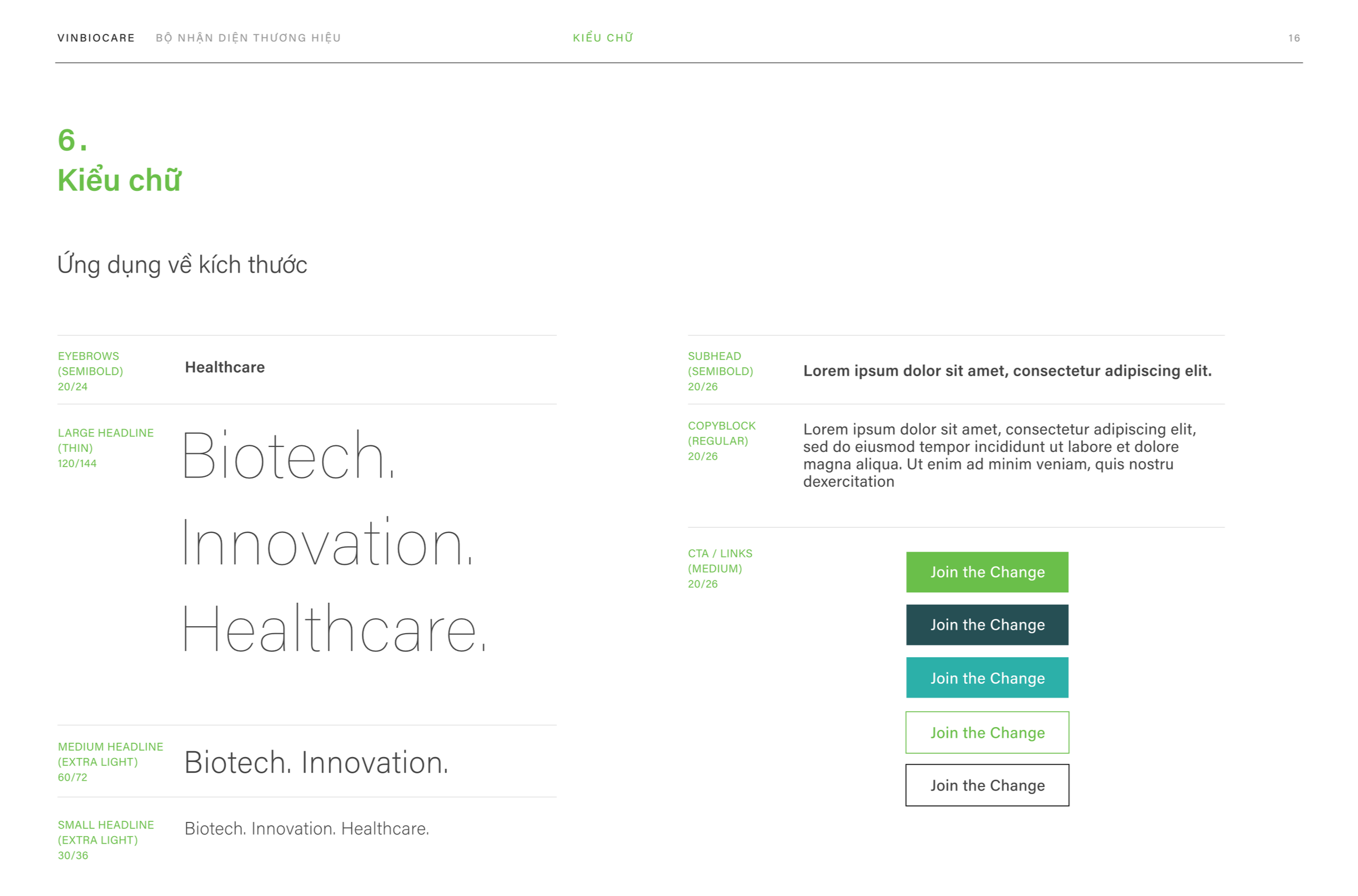
TRANSLATING SCIENCE INTO FORM
The core visual language is built around the contrast between structure and movement, reflecting the dynamic nature of biotechnology. Flowing lines evoke growth, transformation, connection, and the continuous progress of science.
These forms are more than decorative elements — they become a distinctive graphic signature that can flexibly evolve across different brand applications and touchpoints.
Combined with structured layouts, clean typography, and a distinctive color palette, the system creates a balance between scientific precision and contemporary energy, making VinBioCare feel credible yet full of life.
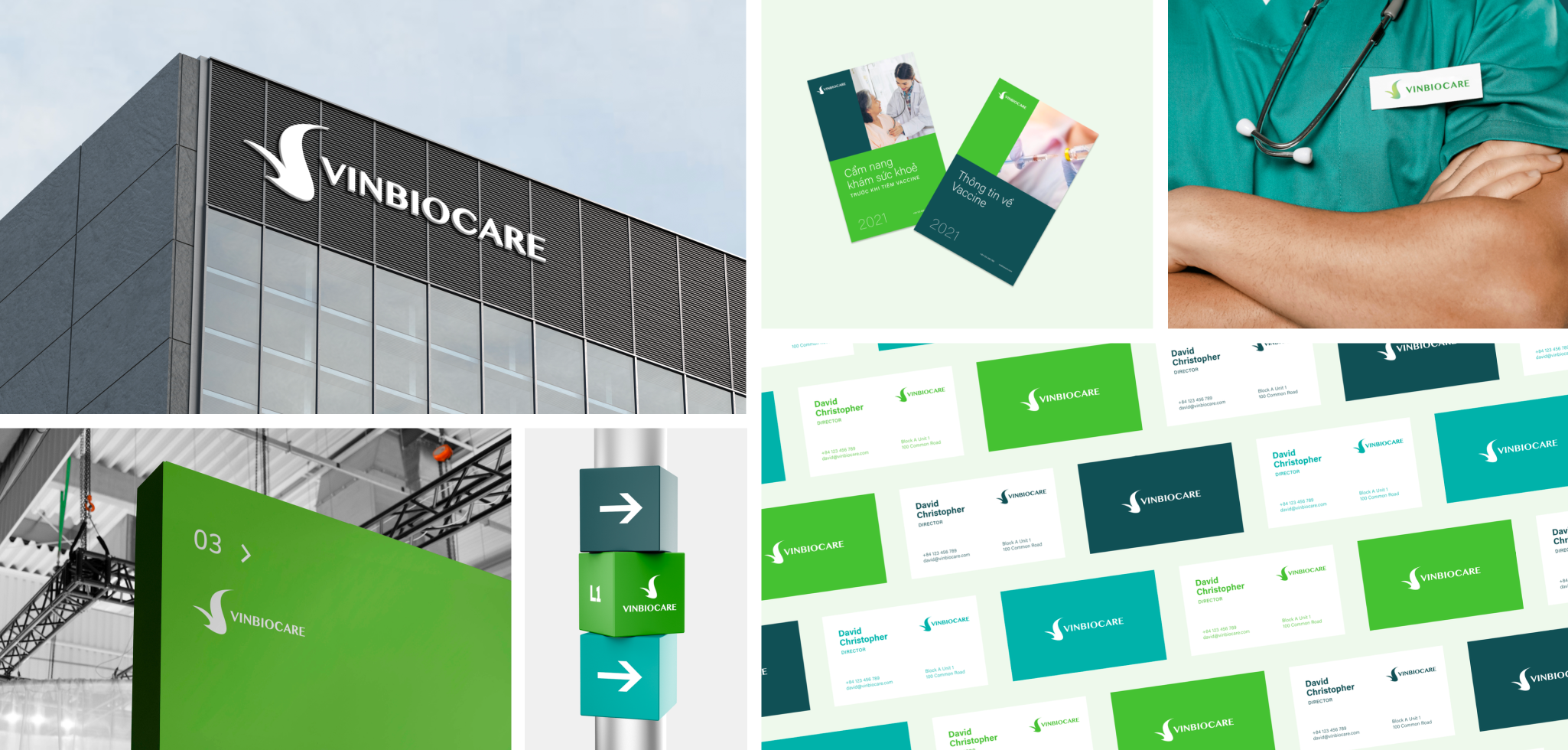
COLOR AS A BRAND SIGNAL
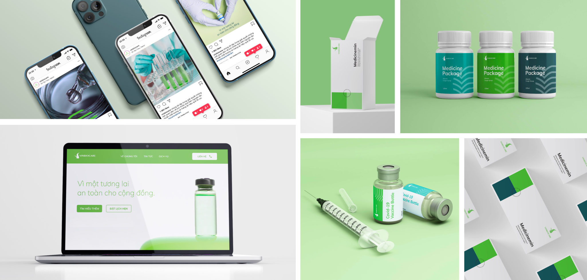
Green becomes the primary visual anchor of the system. Beyond its associations with biology, growth, and life, the green palette gives the brand a fresh and contemporary character. Rather than following the conventional clinical aesthetic of white and blue often associated with science, green offers a more approachable and progressive expression of biotechnology. Supported by neutral tones, the palette remains distinctive while maintaining clarity across different applications.
Color therefore functions not only as an aesthetic choice, but also as a tool for recognition, navigation, and visual consistency.
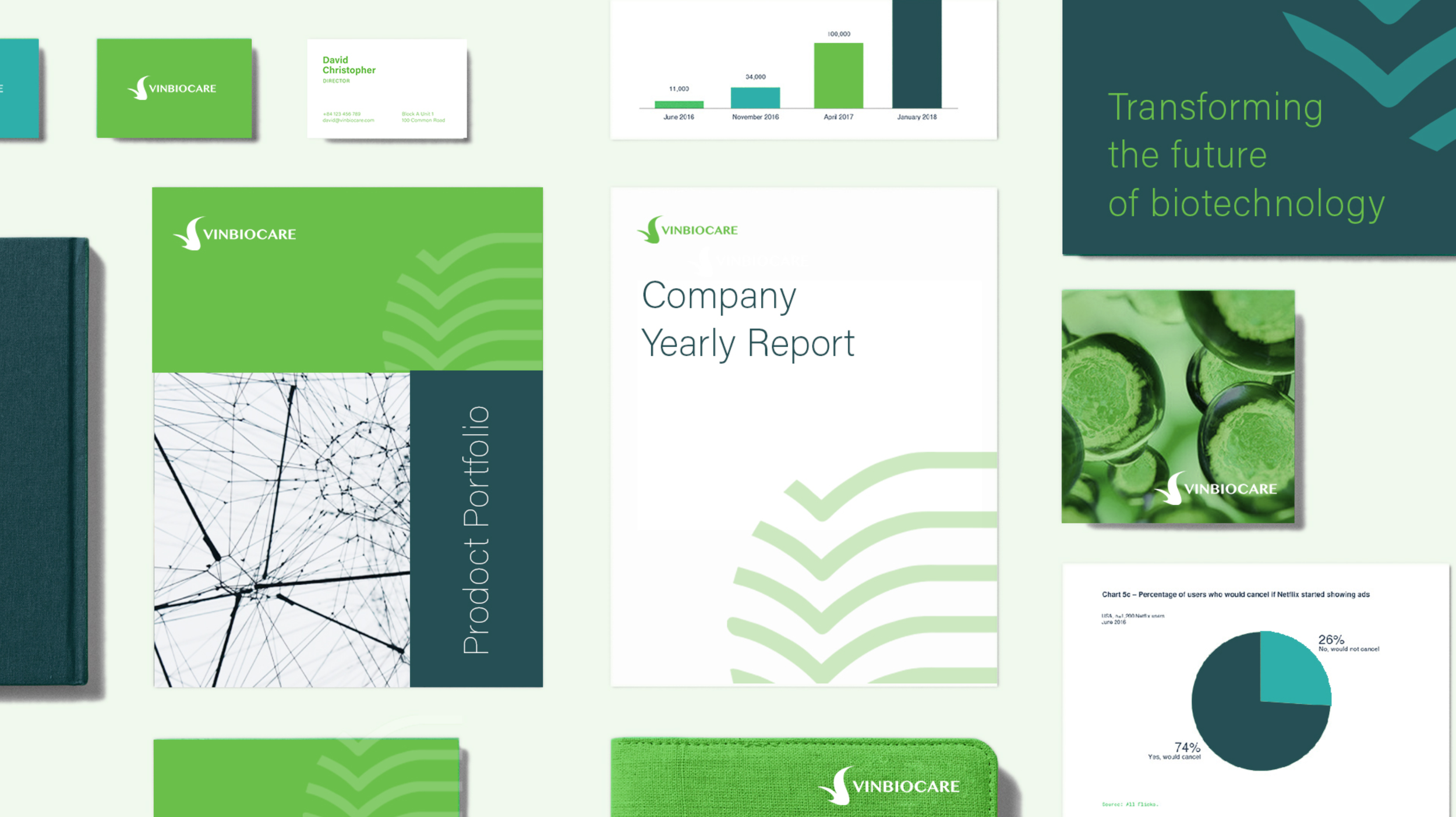
A SYSTEM, NOT JUST AN IDENTITY
The design is developed as a modular visual system, allowing individual elements to work independently while remaining part of one cohesive brand language. NEWNOW approached the identity as a scalable design system rather than a collection of standalone assets, building a toolkit that could adapt across different brand touchpoints.
The system is built around:
COLOR
A distinctive green-led palette establishes immediate brand recognition.
LINE
Flowing lines create a sense of growth and become a signature graphic element.
GRID
Structured layouts bring clarity and communicate scientific precision.
TYPOGRAPHY
Clean typography establishes hierarchy and readability.
SPACE
Generous negative space keeps the identity modern while preventing scientific content from feeling visually overwhelming.
Together, these elements form a flexible visual toolkit that can scale and evolve without losing the essence of the brand.
FROM 2D TO 3D
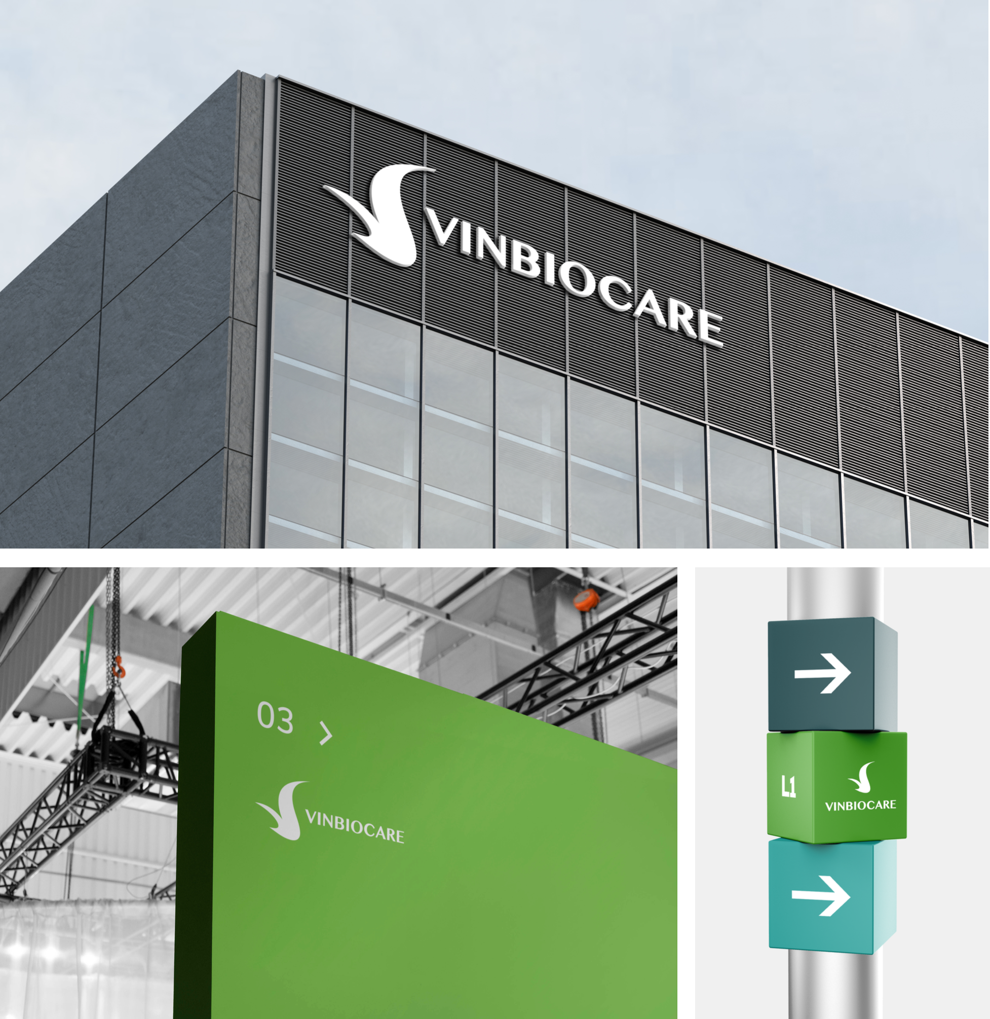
The visual language extends beyond flat graphic applications into physical and spatial expressions, allowing the identity to move naturally from the page into the real world. Flowing lines and organic forms can be translated into dimensional elements, creating a stronger connection between the graphic identity and the brand environment. These elements can be adapted across different scales and applications while maintaining the same visual character. From corporate stationery and printed materials to three-dimensional brand elements and spatial applications, the system creates a consistent experience across different touchpoints.
By extending the identity beyond 2D, the design becomes more dynamic, immersive, and tangible — allowing VinBioCare’s visual language to not only communicate the brand, but also shape how it is experienced in physical spaces.
FROM SCIENCE TO BRAND
NEWNOW is proud to have translated the spirit of biotechnology into a distinctive visual identity for VinBioCare. Through a system-led approach, we transformed the principles of science into a visual language that feels precise yet approachable, scientific yet contemporary — creating a flexible identity designed to evolve consistently across every brand touchpoint.
Project Information
Client
VINBIOCARE
Project
Brand Identity & Visual Systems
NEWNOW’s Role
Brand Identity & Visual Design Partner
Scope
Brand Identity · Visual Language · Graphic System · Corporate Applications
Deliverables
Visual Identity System · Color & Typography System · Graphic Elements · Corporate Stationery · Product & Corporate Materials
